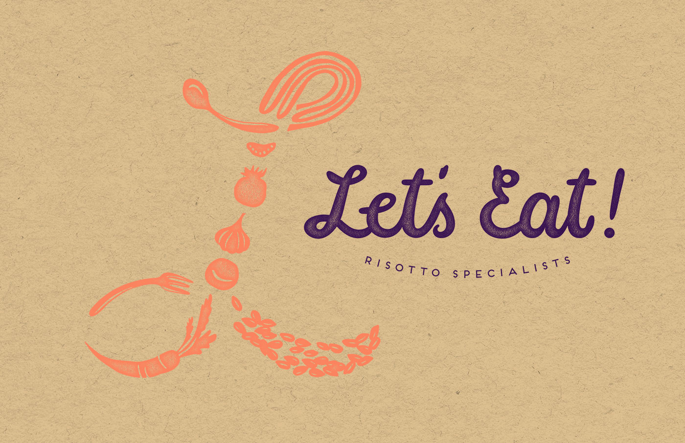
Let’s Eat! is an Italian restaurant based in Taipei and specializing in authentic-style, delicious risotto. To create the restaurant identity, we identified the defining elements of the brand: the idea of sharing and creative, passionate cooking made with high-quality, fresh ingredients.
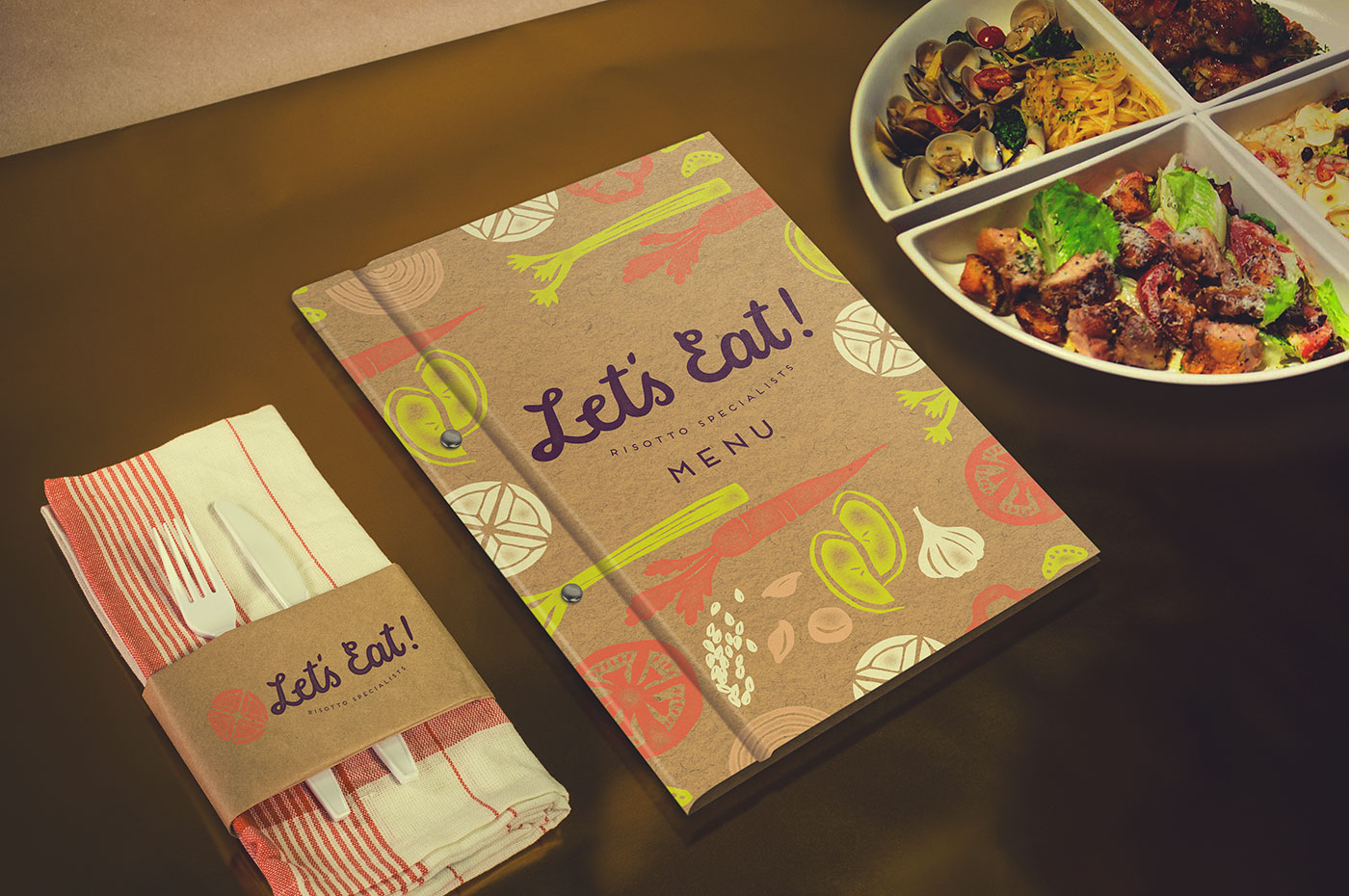
From these elements, we created a logo brandmark inspired by a four-piece set of their signature, custom-made quarter-circle ceramic bowls to signify the idea of “coming together” to share experiences, friendship, and a genuine family meal.
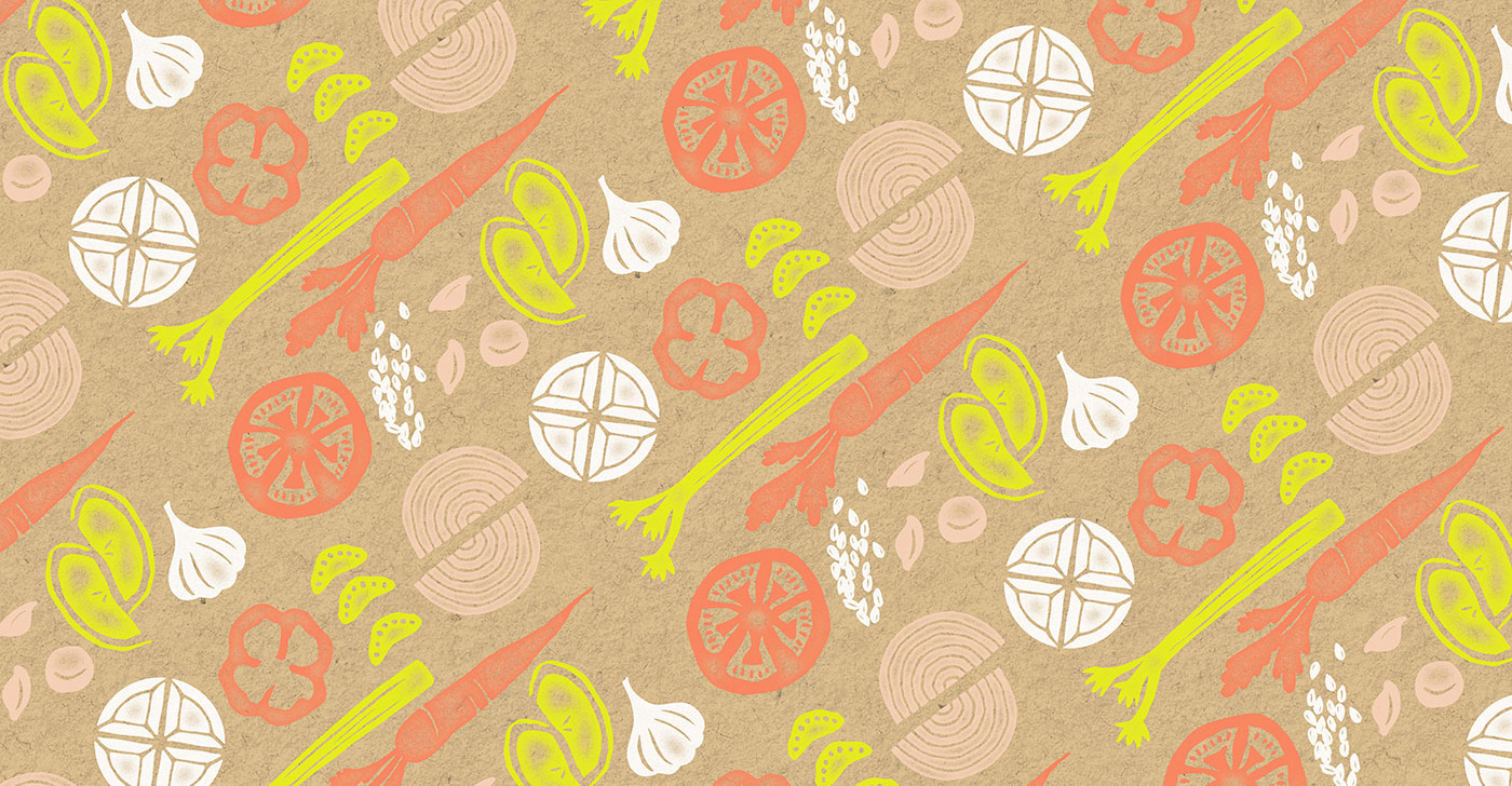
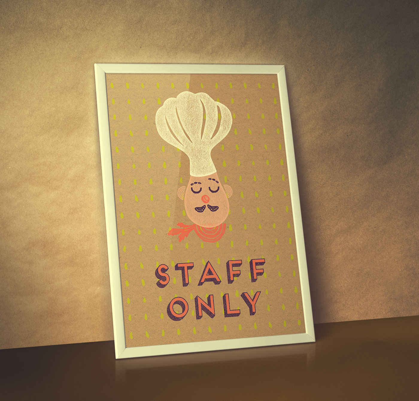
We continued this visual metaphor through aggregating ingredient-shaped elements to create patterns, illustrations, and icons to further this principle at the core of the Let’s Eat! brand.
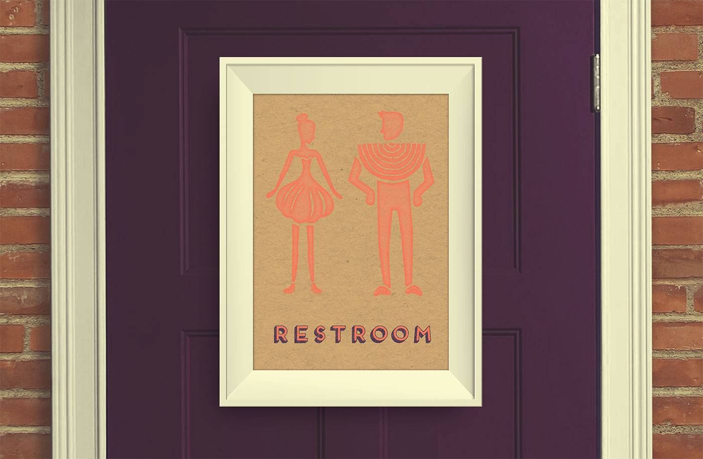
Lastly, to signify a sense of personal hand-craft, we utilized kraft paper and stamp textures to produce a tactile, approachable base for the quirky and colorful illustrative visuals.