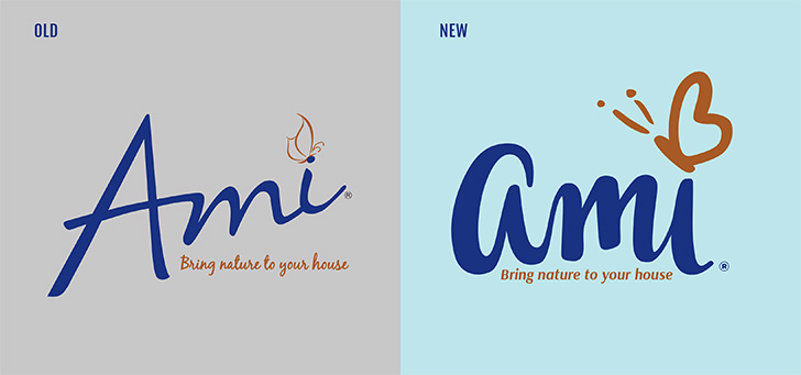
 Overall, this concept made the logo bolder, but still more refined in the use of contrasted thicks and thins, an improved vector drawing, and gererally, a more friendlier, unique feel. A friendly sans-serif font replaced the kind of generic script font used in the original to provide clarity and a contrast to the lettering already used in the logo.
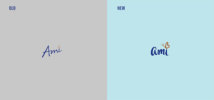 At smaller sizes, the new refinement is more legible and the butterfly is more iconic and visible as a brand asset.
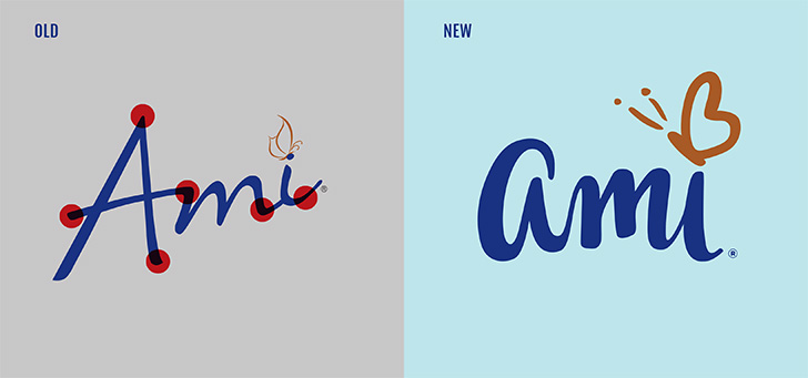 All the edges are now rounded giving it a friendlier, less “hard” feeling.
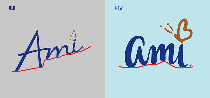 The baseline is more straightened, without losing the calligraphic and loose feel of the original.
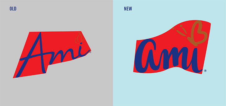 With the original logo, the overall shape and flow of the logo was rigid and square with sharp edges and straight lines. The new logo has a softer and more natural, wavy flow.
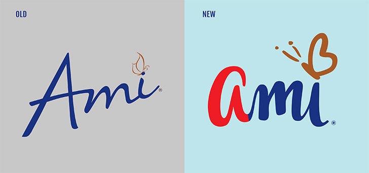 As the name of this concept implies, the Uppercase “A” is now a lowercase “a” to make the brand more approachable, younger, friendlier and allows the calligraphic style of the letterforms to flows together more smoothly.
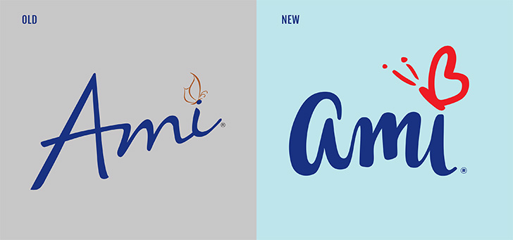 The new butterfly is more elegant and bold, but still exuberant and aligned with the rest of the brandmark logo.
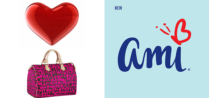 The butterfly also uses a “heart” symbol (as for the French “Mon Amie” meaning friend) as the wing in a style inspired by Stephen Sprouse. With this, you have huge potential to build it as a brand asset and symbol of Ami, similar to the “Bluebird” of Twitter or the “heart” in Cornetto.
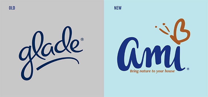 Compared to Glade –Ami’s primary competitor– the new logo is more harmonious, refined, brand-right, bolder and unique.

